Sources
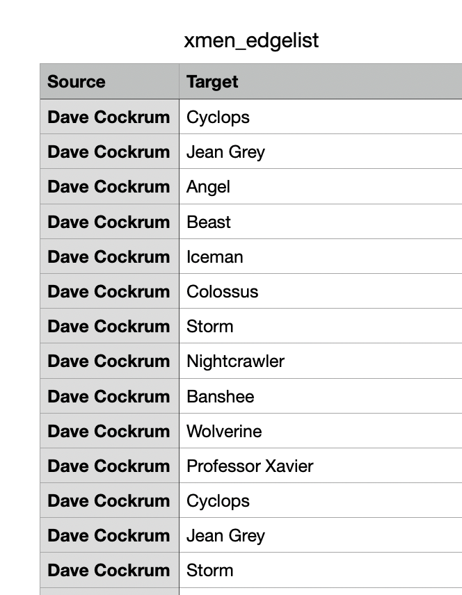
I knew going into class on Tuesday that I wanted to make a graph and do some form of network analysis, so I initially tried the “uncanny-xmen-characters” file, but it was rather complicated. Thus, I used the “uncanny-xmen-covers” CSV file. Essentially, each row of the CSV file represents a cover of an X-Men comic book which includes the issue number, artist, and characters visualized on the cover.


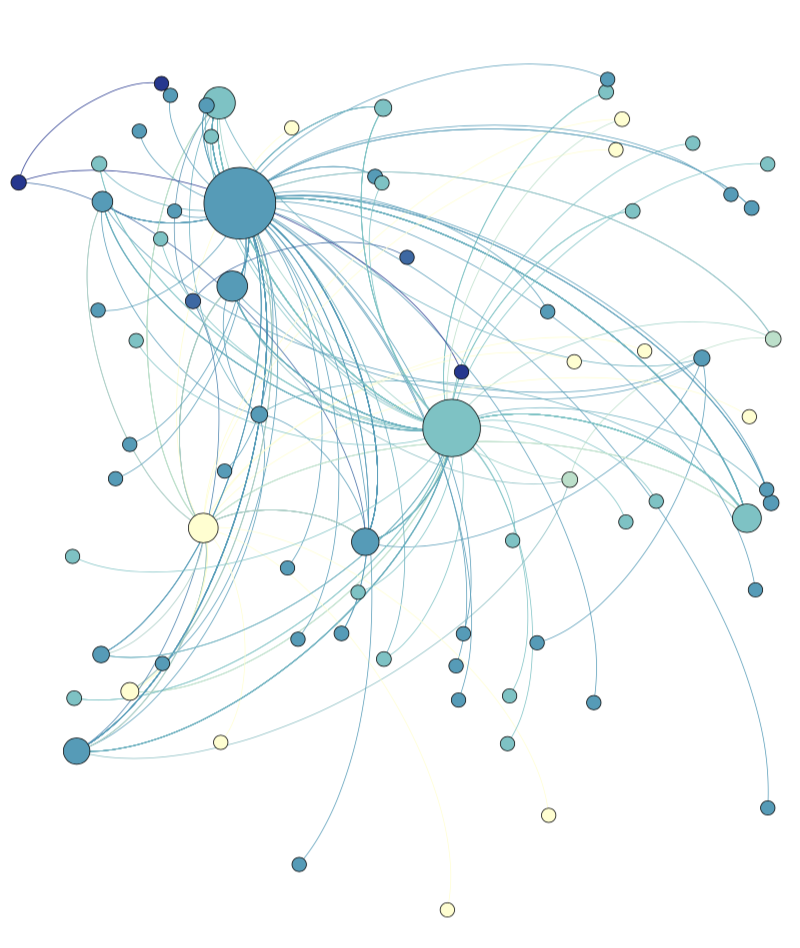
I decided to look at the potential relationships between artists and characters. Did some artists prefer some characters more than others? I used Gephi which is an open-source network analysis software.
Data Manipulation
For those not aware, Gephi requires two CSV files: one that represents the edges and another that represents the nodes. I was given just the “uncanny-xmen-covers,” so I had to use some form of data manipulation. I decided to start with the edge list which has two columns: source (Artist) and target (Character). I initially tried to use Google sheets because I found Openrefine quite intimidating when we did it in class. However, the characters visualized for each issue were all in a single cell, and Google Sheets can only split up cells into columns, not rows, so I decided to dive into Openrefine. For the edge list, first, I deleted all the extraneous columns (issue number and cover images). Then, I had the artist and all the characters visualized. I had to split up the characters into multiple rows. Using the split function, I was able to split all the characters into their own rows, but most of them had a blank entry for the “Source” column, so I used an Openrefine function to fill them with the previous artists. Finally, I clustered the data as there were entries such as “Cyclops*” and “Cyclops” which needed to be merged.
After the edge list, I had to make the node list, A node list has three columns: “node” column for each unique entry, an “id” column for Gephi, and a “node-type” column for analysis – “character” for the character entries and “artist” for the artist entries. This one was much simpler, I just uploaded my edge list file to Google sheets, and I extracted all the unique values from each column and formatted it for the node list. I used Google Sheets because it was quicker for me.

Making a Graph with Gephi
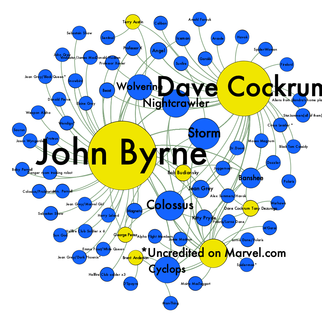
There are many tools available for network analysis, I used Gephi because that is what Austin used for our class data-set. I followed Miriam Posner’s Gephi tutorial. Her tutorial was very accessible for the most part but being made in 2014, some steps were hard to follow as Gephi has since been updated. To summarize, to make a graph with Gephi, you have to import the node-list and edge files following Gephi’s format mentioned earlier. Then, the graph is made, although minimal. To improve this graph, Miriam Posner recommends adjusting the colors of the nodes to match the node-type. I choose blue and yellow to keep with the X-men theme. She also has instructions to change the size of the nodes to match the number of edges it has – larger nodes have more edges. Moreover, she also recommended creating group colors. I tried this, but it made the graph harder to follow, so I stuck with the yellow and blue matching node type.
Website Design
In terms of website design, I prefer a minimal look. I tried something where the background image was an X-Men cover, but that proved to be difficult and made the text unclear to read. In my opinion, it is important to make graphs interactive. I tried my hardest to embed my graph. However, the tutorial did not cover it, and Google was not helpful. I just ended up using a png. I also decided to include pictures of my process with the csv files because people might find that interesting, and it makes the site less barren.
Significance and Takeaways
Graphs and network graphs are used to visualize relationships of data points. This graph visualizes the relationship and frequency between artists and each character. For instance, one can see that John Byrne and Dave Crockum both illustrated Wolverine, Nightcrawler, and Storm often. One can also see that John Bryne has illustrated more underused characters since there are many smaller blue nodes around him. Finally, this project makes me realize the importance of data manipulation which can dictate the strength and meaning of the visualization. For this network graph, the data was simple to manipulate with OpenRefine and Google Sheets. It would have been more powerful I think to have edges represent a shared cover that characters were in. The problem is that is hard to manipulate the data to do that, and I did not have enough time.
I remember when I looked at the Finding Paul Revere project, they changed the data to an adjcancey matrix to make each edge represent a shared organization. If I had more time, I would like to do something like that with this data where a shared organization is a cover. Overall, I am glad I was able to get this working, and graphs seem to be a very useful tool!